
In 2016, I co-led the design team for the Hack@Brown hackathon. We developed a common design language and then applied it to a website, posters, promotional materials and apparel.
Building a brand identity
In October of 2015, we met in a room at RISD and sketched out the core values our brand needed to communicate. I don’t have the exact notes, but they crystallized down in my mind to these 4:
- Inclusive and approachable — we strove to put on an inclusive event, including participants from under-represented identities in tech and participants with different levels of experience.
- Sophisticated, but not intimidating — Our brand had to be cool enough that you wouldn’t feel embarrassed to tell your friends you’re spending the weekend working on your laptop in a big crowded room. We also had to communicate that just because Hack@Brown is open to people from different backgrounds doesn’t mean it isn’t as technically saavy or impressive as other hackathons.
- More than technical — I think Chén, our design director last year, put this well in his writeup of last year’s design: “We’re grounded in technology, but don’t idolize its existence.” Our materials needed to make it clear that Hack@Brown is about technology, but not just code— design, creativity, and the humanities are just as important.
- Fun — Hack@Brown isn’t about competition; it’s about learning, building, enjoying yourself and meeting new people. We don’t think you need fancy prizes to get a bunch of college kids to spend their entire weekend learning building things.
As a team, we brainstormed various visual styles, looking for something that reflected those values:
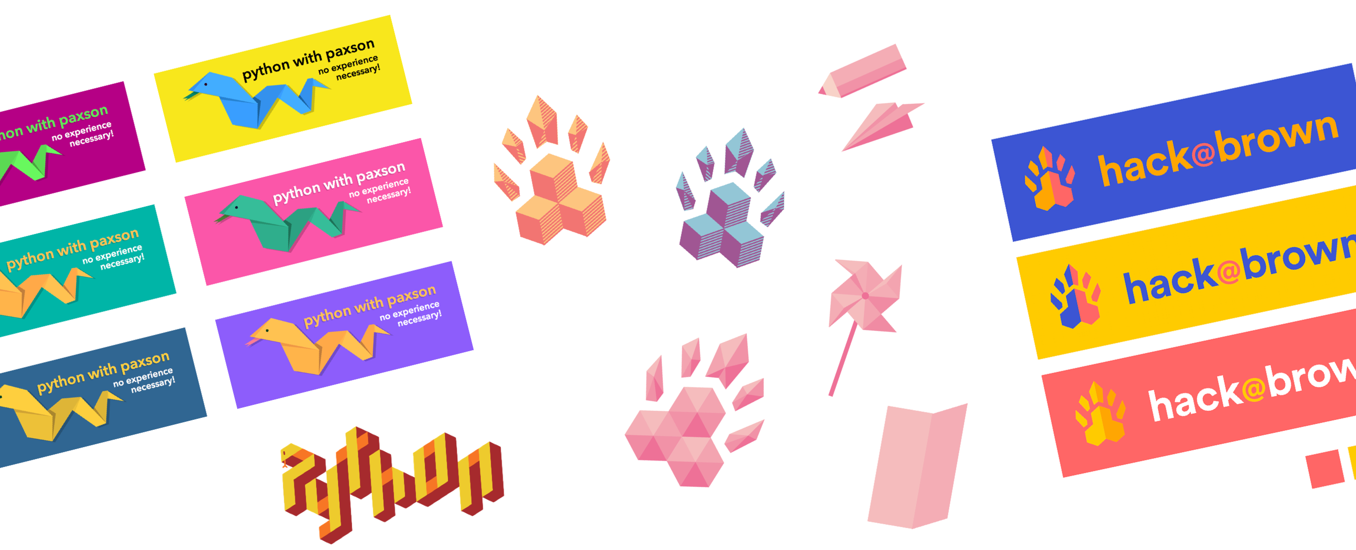
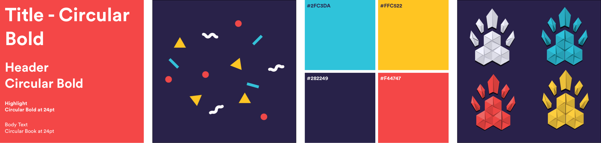
Eventually, we settled on a set of colors, a typeface, and a paper motif – confetti, and a paper treatment of our existing logo:
The various brand elements were versatile enough to allow us to produce a wide variety of graphic material that felt fresh and diverse but was clearly part of the same brand – I produced some of these, and other members of the team produced the rest:
Hack@Brown on the web
While I wasn't building mockups for the Hack@Brown website myself, I did provide direction and suggest priorities for the project. Together, we decided that showing imagery and video to prospective attendees was paramount, to counter many peoples' negative assumptions of what hackathons are like.
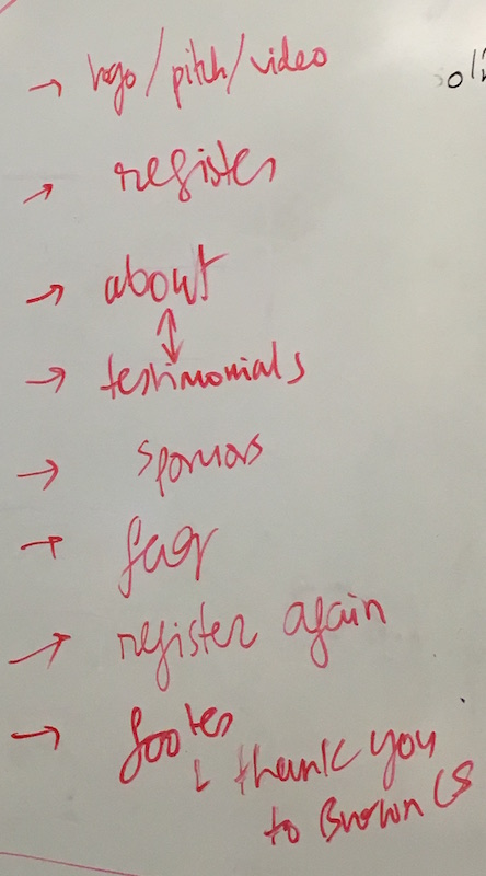
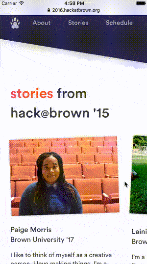
I also provided input on the site's navigational structure – rather than separating FAQ, schedule and testimonials on separate pages, we built a single-page site that used horizontal scrolling on mobile to reduce the vertical height of sections.
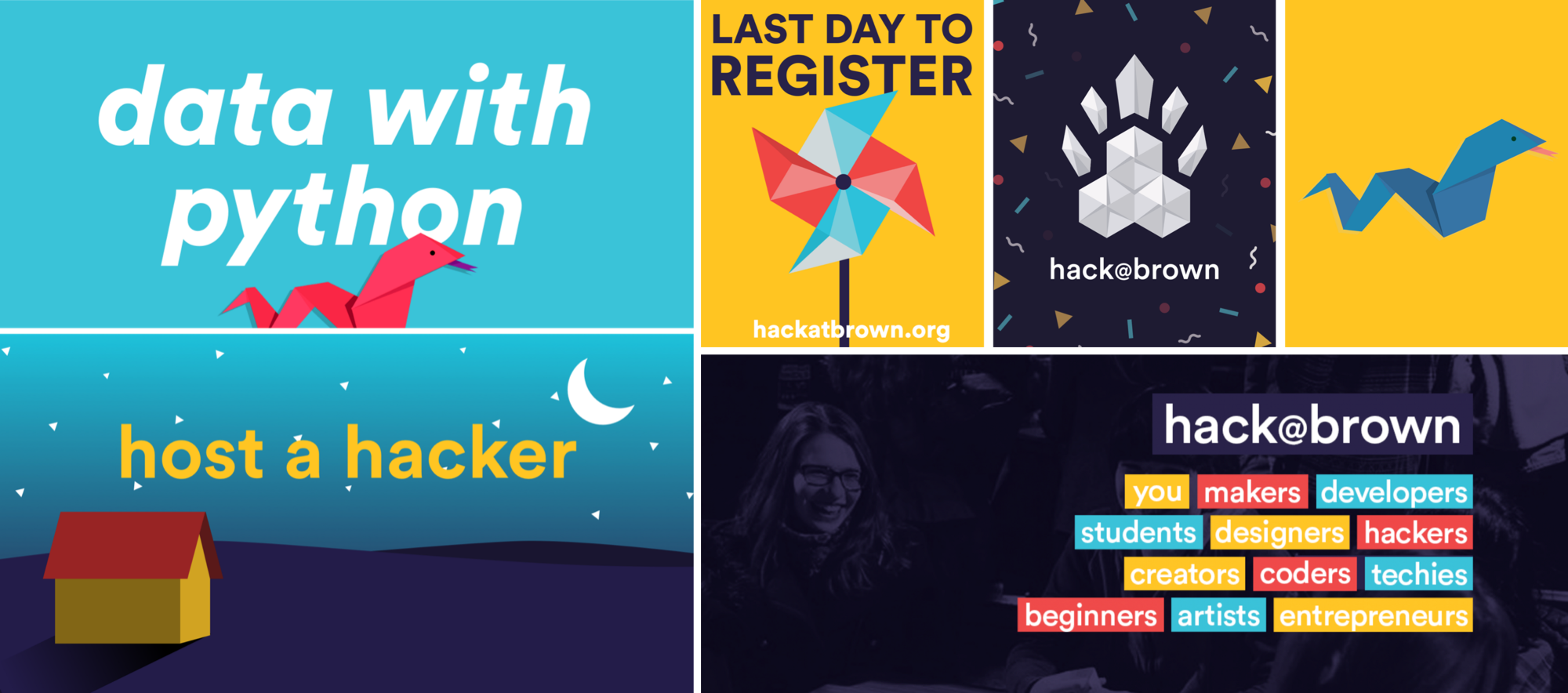
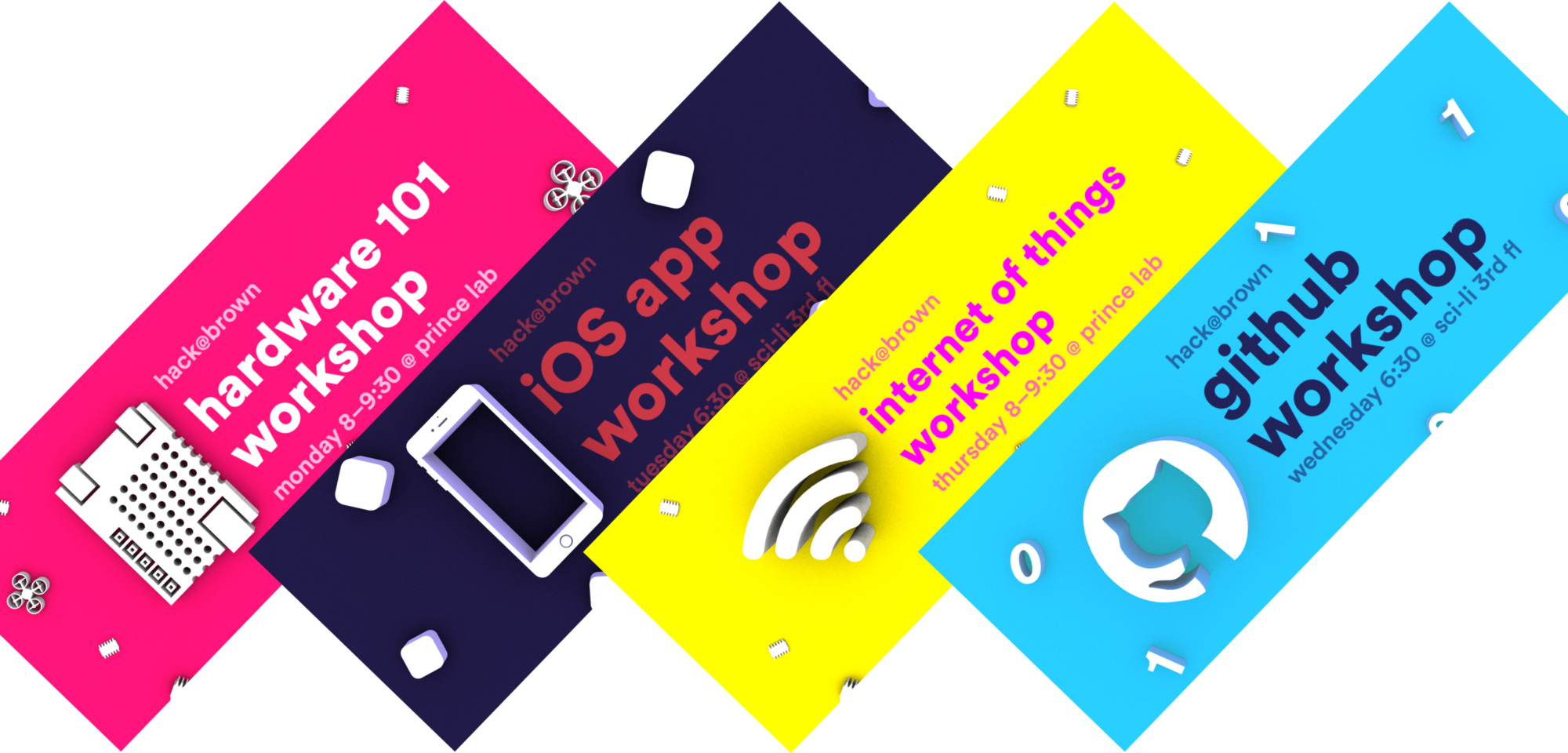
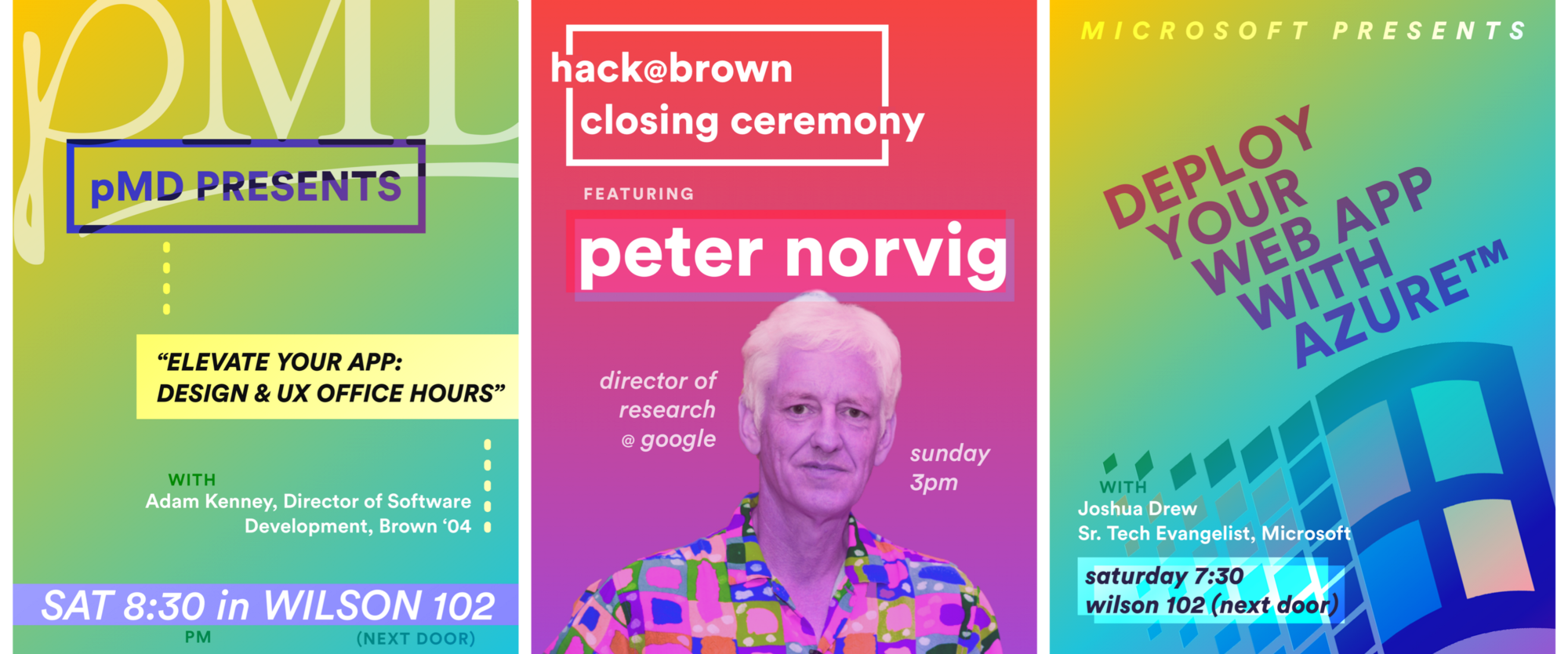
Variations on the brand
For a week of workshops leading up to the hackathon, I used Clara.io to create a series of ray-traced 3d promotional images that, while visually distinct from the hackathon, still evoked the brand:
Likewise, I designed a series of posters for day-of events that had their own unique identity while staying true to the brand:
Outcome
Hack@Brown 2016 went really well, and our design played a big part in attracting the right attendees and setting the tone of the event. The team worked really well together – our two non-lead members are staying on to lead the design team for 2017. It's probably just a coincidence that at least three hackathons are using Circular as part of their branding for the next year – but we've heard from plenty of other design teams that Hack@Brown's design was successful and influential.