Evolving InstaGrade
In 2014, I decided to redesign my iOS app, InstaGrade – an app for teachers to grade multiple-choice tests with an iPhone camera. I'd originally built the app in 2012, visually refreshed it and fixed bugs – but in 2014, armed with more than a year of user feedback, I decided to completely redesign it.
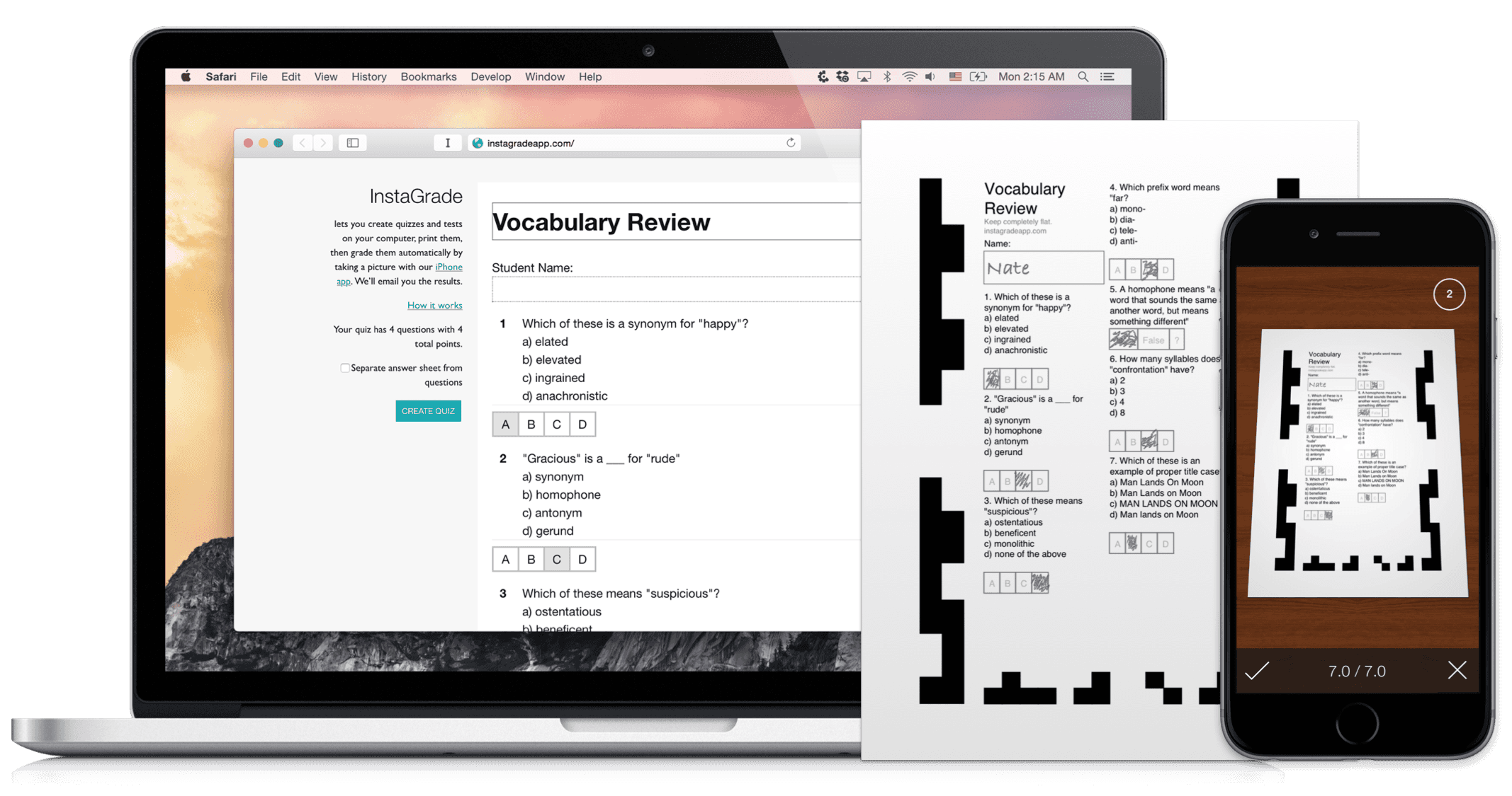
InstaGrade, pre-redesign
InstaGrade v1 was a standalone app – there were two answer sheets (a 24 and a 56-question version) that teachers could print out. Answers would appear inside the app, and grade reports could be exported as a PDF.
Increasing Customization
A recurring theme from InstaGrade user feedback was customization – different teachers had different needs, and no one answer sheet was perfect.
I need 5 answer choices (A-E) and the ability to select multiple answers
It'd be nice to have shorter answer sheets with less than 24 questions, so my students aren't confused
I need to give different point weights to different questions.
True or false questions!
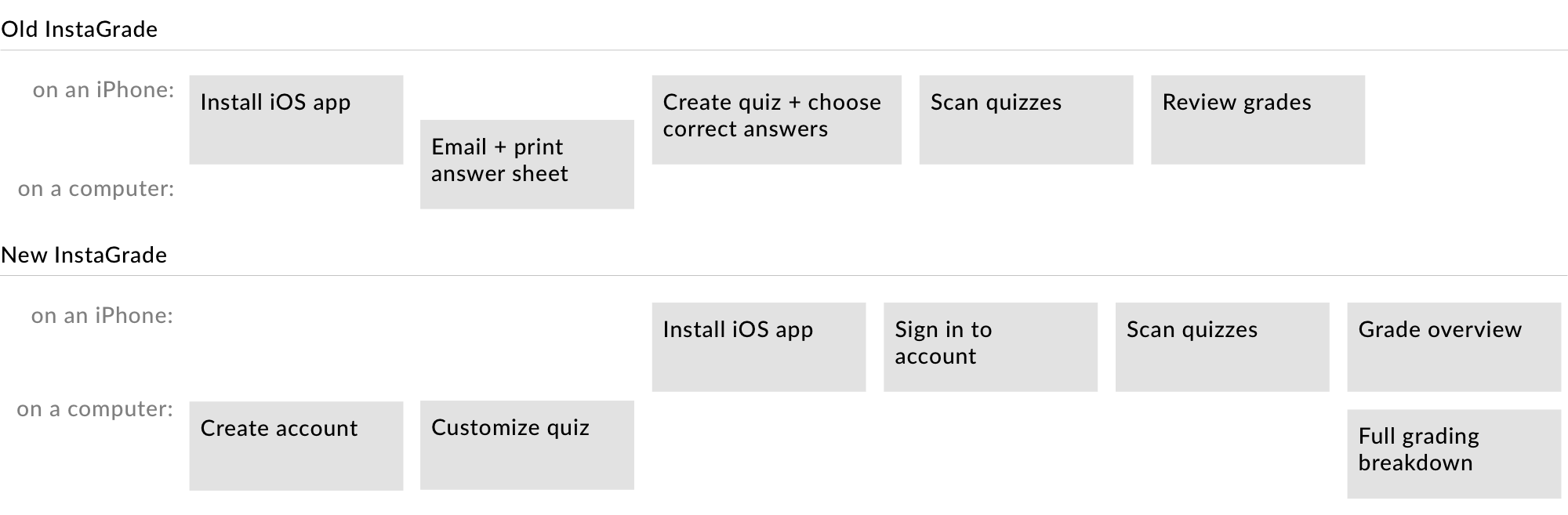
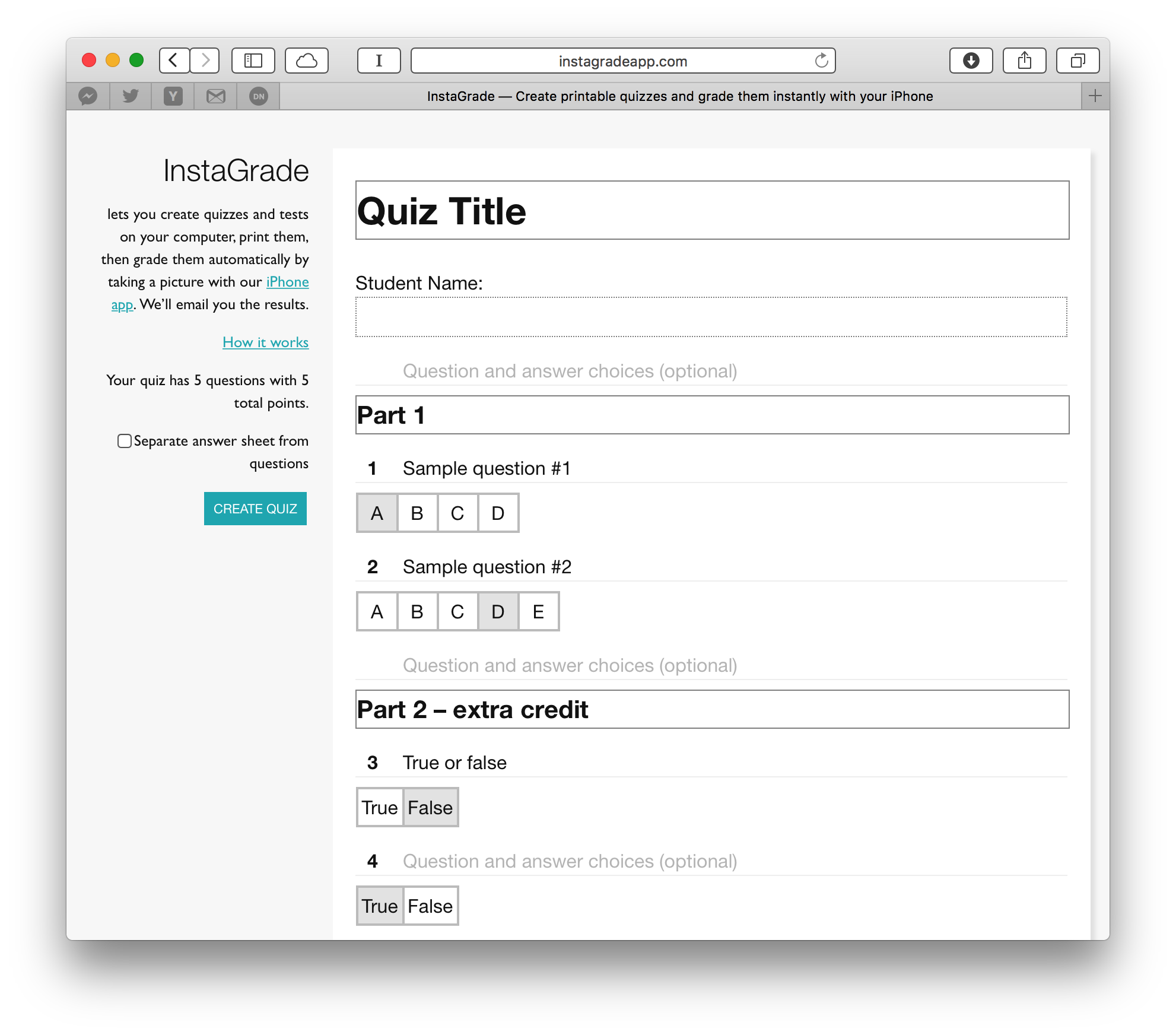
Since so many teachers had so many different requirements, I decided to ditch one-size-fits-all answer sheets in favor of an online quiz builder that would generate quizzes question-by-question. This had a couple added benefits:
- Rather than printing separate question sheets and answer sheets, customizable answer sheets could have questions on the same page
- Quizzes could have spaces for writing short-answer questions that'd be graded by teachers manually during the scan flow.
- Answer sheets could have barcodes embedded linking them with the quiz they represented.
I figured that teachers wouldn't want to type quiz questions into their phones, so I settled on an online quiz builder. This took InstaGrade from a standalone iPhone app to a cross-platform, account-based online service. This complicated the user flow significantly–a downside I hoped would be justified by the increased functionality.
Revamping the scanning screen
I redesigned InstaGrade's scanning screen with a couple goals in mind:
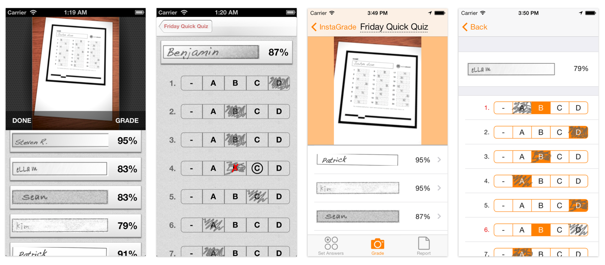
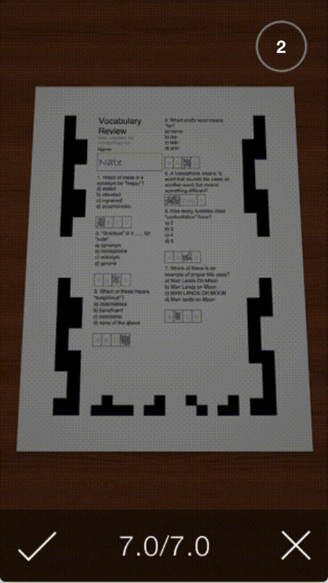
- Better accuracy with continuous scanning – InstaGrade v1 required users to tap the screen to start scanning. A frequent customer complaint was that scans would fail, but would work fine if scanned again. This seemed like an unavoidable technical issue – camera position or random image noise caused a certain percentage of scans to fail, and re-scanning solved this. Rather than requiring users to tap the shutter button multiple times, I moved to an automatic scanning model – the app would continuously scan whatever was in its view, and the most recent successful scan would appear anchored to the bottom of the screen until saved or dismissed.
- Simplified screen with larger camera viewfinder. When scanning, teachers are shuffling papers and switching focus between their desks and their phone screens – the more complex the scan screen, the more cognitive load it is to context-switch back to the app.
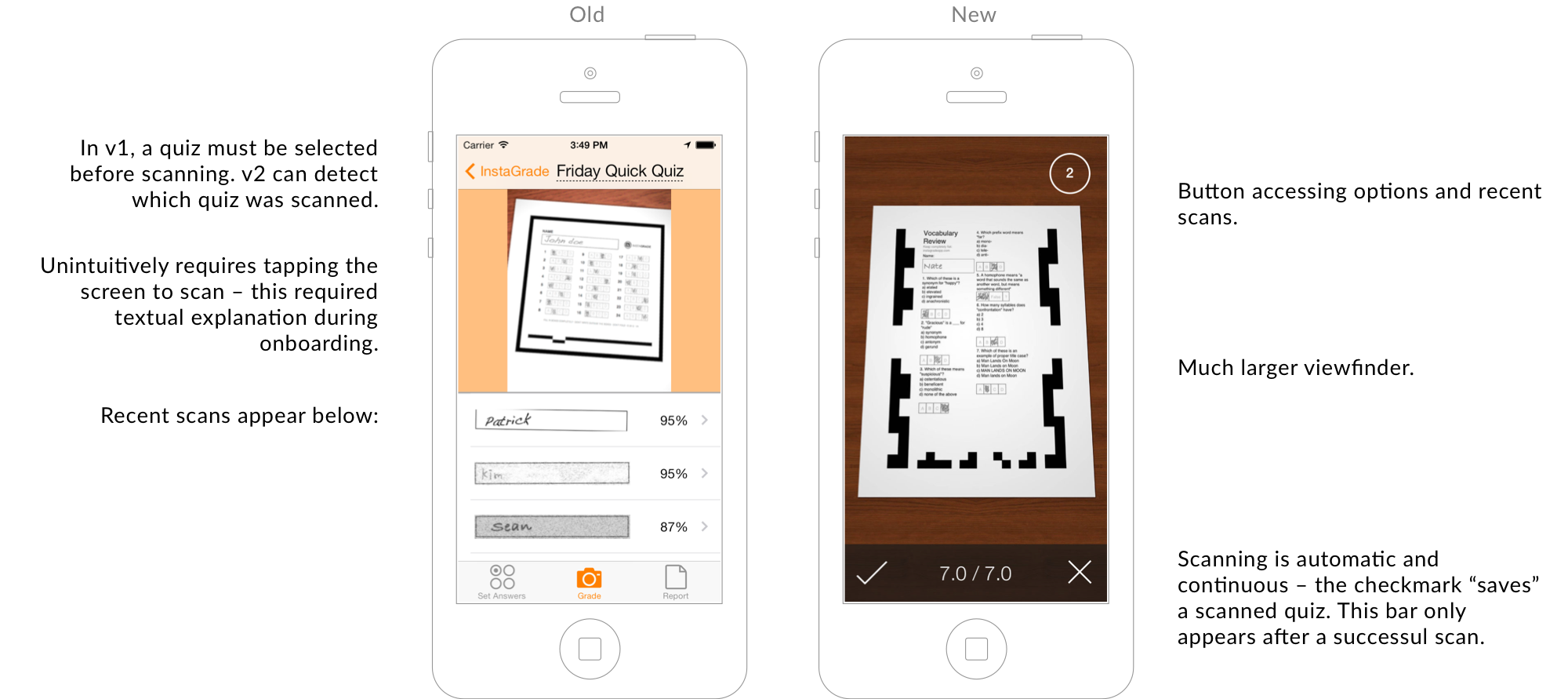
A downside of the new scanning interface was that it isn't immediately apparent how to view previously scanned quizzes. It helps that there's only one button – still, I used an animation as an affordance to show users where their graded quizzes could be found.
Tying web and iOS together with a consistent brand
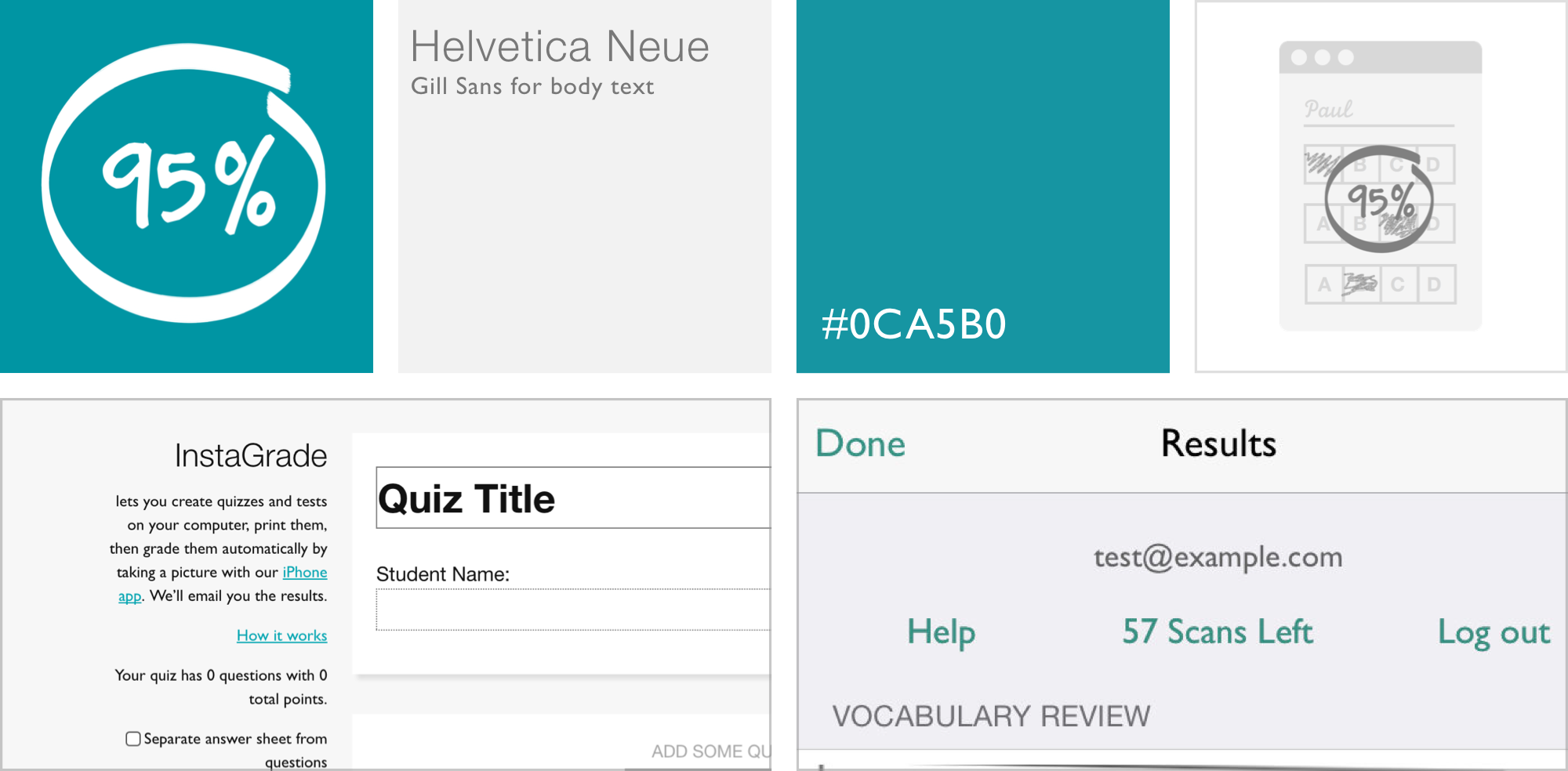
I didn't begin the InstaGrade project with a consistent brand in mind. As I iterated on the visual style pre-v2, a brand identity developed slowly – for the redesign, I codified it, picking a single accent color and a pair of typefaces. I tried to compelement these with simple illustrated graphics, and while they aren't the most aesthetically pleasing, they still play an important role breaking up the monotony of text in places like the onboarding flow.
Outcome
I'd characterize the outcome of the redesign as a mediocre success. Existing users were excited to be able to build customized quizzes, and some adopted them enthusiastically. However, I worry that the added complexity of hopping across platforms – building quizzes on the web and scanning them on a phone – hurt new-user adoption. If I were to redesign InstaGrade again, I'd probably make quiz customization an optional feature – users would be able to sign up and scan generic answer sheets without ever signing up on the web. I'd try to balance the experience between the two extremes of old InstaGrade and new InstaGrade – a simple new-user experience that allows users to ramp up customization gradually.